Data Visualisation
What is Data Visualisation
In simple terms, data visualisation is the representation of information in the form of a chart or diagram. Visualisations help tell stories by curating data and communicating information both clearly and efficiently. Learning to communicate your data in this way is both an art and a science.
Visualisations do not need to be boring to be functional, nor do they need to be sophisticated to look beautiful. A truly successful visualisation will help make complex data more accessible and enables readers to both analyse and reason with the underlying data.
The main purpose of a visualisation is to communicate information.
Different Types of Visualisation
Before you start to think visually, take a moment to consider the nature and purpose of your visualisation. It is helpful to consider your visualisation as existing across a spectrum of two gross domains. First, it is either conceptual or it is data driven. Conceptual visualisations express ideas whereas data driven visualisations express statistics. Second, your visualisation is either declarative or it is exploratory. Declarative visualisations communicate information while exploratory visualisations try to figure something out. You can plot your visualisation onto the diagram below once you have figured out where it lies within this spectrum. Use this diagram to categorise your visualisation into one of four categories: idea illustration, idea generation, visual discover and everyday data visualisation.
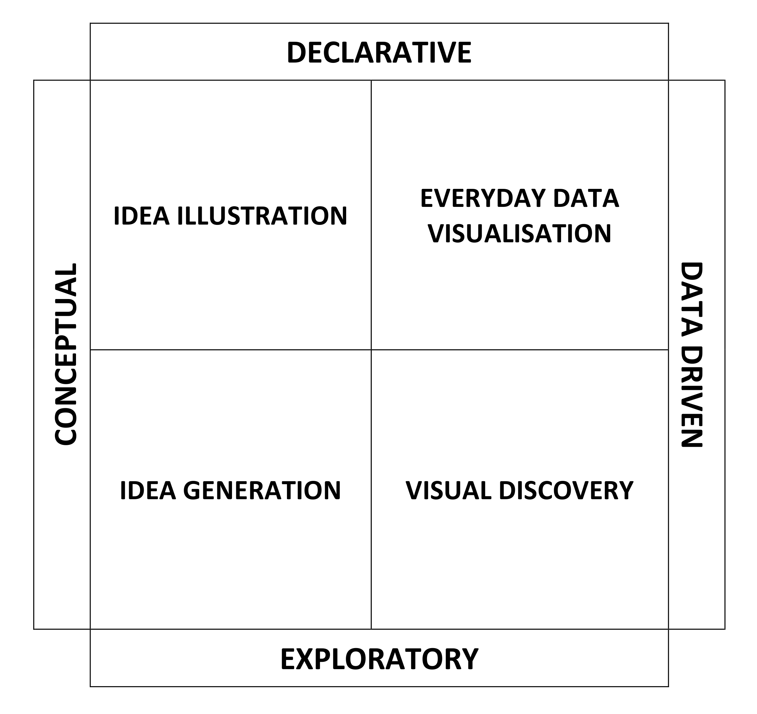
Idea Illustration
Idea illustrations clarify complex ideas by drawing on our ability to understand metaphors and simple design conventions. Examples might include decision trees or hierarchical diagrams. These visualisations require clear and simple designs with a logical structure and flow of ideas. Strip ideas back to their bare essence.
Idea Generation
Idea generation relies on conceptual metaphors and will typically take place in more informal settings such as brainstorming sessions or strategy sessions. Idea generation is used to find new ways of doing things and to offer support while answering complex questions.
Visual Discovery
Visual discovery is used for large complex data sets. Most scientific research will fall into this category. Visual discovery encompasses two separate domains. It is used for visual confirmation (testing a hypothesis) and visual exploration (looking for patterns and trends).
- Visual confirmation answers whether your hypothesis is true and considers the best ways to depict the idea being tested.
- Visual exploration is used to discover new and unexpected insights by depicting data in many different ways.
Everyday Data Visualisation
Everyday visualisations are basic charts and graphs that can be made on the fly to understand data. They are usually simple and involve small amounts of data for setting context within presentations.
Visualisation and Deception
We’ve all read scientific articles before and I’m sure you have noticed how figures are fundamental components. This is because visualisations show how the gathered research data supports the key findings of the article. Unfortunately, visualisations are only as good as the information they portray and they will easily deceive users if they are based upon improper statistics or neglect key aspects of the data. After all, most people will believe any results if they are shown in a well-presented figure.
Typically, authors use figures to present summary statistics of their data. While this might seem like a good way to present data, it is not recommended when the sample size is small and there is not enough data for the summary statistics to be meaningful. This is because there is often not enough data to assess the sample distribution while small samples are easily distorted by outliers. The use of summary statistics is only suitable if performed appropriately. View our article on descriptive statistics for more information on how to perform summary statistics.
Visualisation Choice
The choice of visualisation is equally important. Many scientists choose to use bar and line graphs to represent continuous data. They will use them to show the mean alongside the standard error or the standard deviation of their results. This is a particularly bad idea because many different distributions of data can lead to the same bar chart or line graph. This is illustrated on the diagram below. Furthermore, use of paired data (i.e. side by side columns on a bar chart) could erroneously suggest that groups being compared are independent of one another.
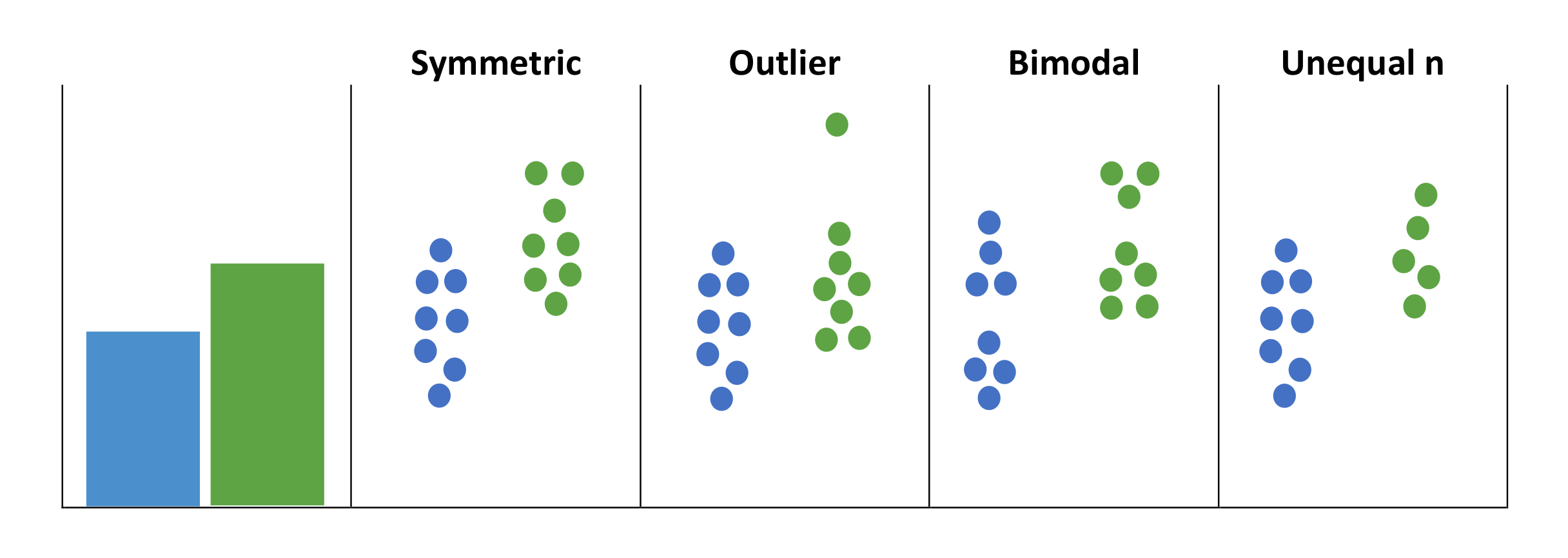
Charting Error and Deviation
The use of the mean with standard error or standard deviation within visualisations can cause readers to wrongly infer that data is normally distributed with no outliers. It is also important to recognise how they are calculated because both measures can give very different visual impressions. Standard deviation measures variation in the sample and standard error measures the accuracy of the mean. The standard error is strongly dependent upon sample size and will decrease as the sample size increases. Thus, if two samples have the same standard error, the one with the larger sample size will have the larger standard deviation.
Honest Presentation
A better idea is to provide detailed information about the distribution of the data or to display the data in full. This enables readers to examine the data and detect any gross violations of the statistical assumptions. Additionally, readers are able to get a better grasp of the study design, and this will enhance their ability to understand the data. Visualisations that enable exploration of data distributions include univariate scatter plots, box plots and histograms.
If your data is from a small sample size and you cannot be certain that it is normally distributed, it is best to use non-parametric tests and show the median value as opposed to the mean. This is because a mean is easily misled by outliers or skewed distributions. When paired or matched data is used, authors should report the median difference rather than the median values for each condition. When creating your visualisations, remember to always consider the type of outcome variable (categorical vs. continuous), the sample size and the study design (independent vs. non-independent).
Selecting Your Visualisation
There are some fantastic websites out there to help you choose what kind of visualisation you can use to represent your data. Two well thought out examples include the datavizproject and the datavizcatalogue. Both websites allow you to search by function, summarise the different types of visualisation available and offer a brief explanation of each type. Below is a brief summary of the different types of visualisations available. Visit the websites above for a more in depth and interactive experience.
Distribution
Distribution charts display frequency in the data and/or how spread out the data values are. They are useful for generating shapes or patterns that provide insight into the kind of distribution present in the dataset.
- Box Plot
- Density Plot
- Histogram
- Violin plot
- Dot Distribution
- Barcode Plot
Comparisons
Comparison charts help communicate the differences or similarities between values within a dataset. They are often used to make comparisons across categories and/or for communicating the ranking between categories.
- Bar Chart
- Column Chart
- Grouped Bar Chart
- Stacked Bar Chart
- Slope Graph
- Lollipop Chart
Data Over Time
These charts are used to show data changing over a time period in order to communicate or analyse trends and patterns within a dataset.
- Area Graph
- Control Chart
- Heatmap
- Line Graph
- Gantt Chart
- Streamgraph
Proportions
These charts use area size to communicate differences or similarities. This can be to communicate magnitude, flow, to compare values or to show parts-to-a-whole relationship.
- Bubble chart
- Marimekko Chart
- Pie Chart
- Treemap
- Sankey Diagram
- Bubble Map
Connections
These charts communicate or analyse how things are connected, the structure of networks or the relationships contained within networks.
- Network Diagram
- Arc Diagram
- Circular Tree Diagram
- Hive Plot
Hierarchy
These charts are used to communicate and/or analyse how things are ranked and ordered together in an organisation or system.
- Tree Diagram
- Treemap
- Sunburst Diagram
- Circular Tree Diagram
Parts-to-a-Whole
These charts are used to show proportions in a parts-to-a-whole relationship. They show how the parts of a variable relate to a total and can be helpful in showing how data is divided up.
- Stacked Bar Chart
- Pie Chart
- Marimekko Chart
- Treemap
Flow
These charts are used to communicate the movement and flow of entities or to communicate how a process or system works.
- Alluvial Diagram
- Sankey Diagram
- Flow Diagram
- Parallel Sets
Correlations
These charts are used for finding and/or showing the correlation between two or three variables.
- Bubble Chart
- Heatmap
- Scatterplot
- Correlation Matrix
Tips for Data Visualisation
Most people will believe what they are told provided a chart is involved. Ensure you use your visualisations correctly and place the audience’s best interests at the heart of the design. There are many ways a chart can distort the truth, communicate the wrong message or make data difficult to decipher. You should be using visualisations to make data accessible.
Try not to over-simplify or dumb things down. Just be direct and get your point across. Learn how to create simpler and more effective charts by learning about some common design pitfalls that can be easily avoided.
Less is More
Perfection is achieved when there is nothing left to take away. Do not overdress your charts with unnecessary elements and use excess colour or special effects. Banish chart junk: backgrounds, borders, shading, grid lines and useless labels.
Draw attention to your data by using the least amount of ink to communicate your message and remove anything that is distracting. Ensure you are only using colour to communicate information and not for decoration. Too much colour can confuse and disorient, while just the right amount will highlight data.
No Guessing Needed
Thoughtful use of text ensures that everyone knows what is going on. Give every chart an axis and a title. Annotation will help make the graph more accessible but should be kept brief and relevant. Don’t forget the scale and units of measurement.
Ditch the Decimals
Round off numbers before plotting as the extra decimal places are often useless. The level of precision should not exceed the level needed to serve your communication objectives and the needs of your viewers.
Bar Chart Baselines
Bar charts are very good for comparison. For meaningful conclusions, bar charts should begin at a zero baseline and be presented in full. This is because our eyes must compare the heights of the bars. If we only see the tips of the bars, it can exaggerate the differences in the data. Truncation causes misrepresentation.
Line Chart Aspect Ratios
Line charts show a trend. This can be manipulated by increasing the chart height (exaggerating effect) and by widening the chart (underplaying effect). This is because the aspect ratio is easily changed without being noticed.
Tables for Comparison
Tables are good for looking up individual numbers. Help people compare numbers by aligning whole numbers on the right and making it easy to see different magnitudes.
Dual Axis Charts
Charting two sets of data with one scale on the left and another on the right can be confusing. They take effort to understand which axis should be used to read which data and it may even suggest a relationship that doesn’t exist. The comparison of magnitudes on dual axis chart is meaningless data sets are on different scales.
Sometimes things should just be kept simple. If you have only got one or two values, then just show the numbers. You don’t always need a chart!