Run Charts
By now you’ve managed to run your PDSA cycle and gather some data both before and after the intervention. This section will discuss the best way to present your data for the outcome measure and how to interpret it. Don’t forget the process and balancing measures you have collected. They should be analysed alongside your outcome measures.
Basics of a Run Chart
The best way to visualise the effects your changes have been having is to plot a graph over time, thereby creating a run chart. This can be done both during and after the collection of data. It will help in two different ways. First, it provides feedback for the changes you have made. Second, it helps you understand the normal variation that is encountered as the outcome measure is collected.
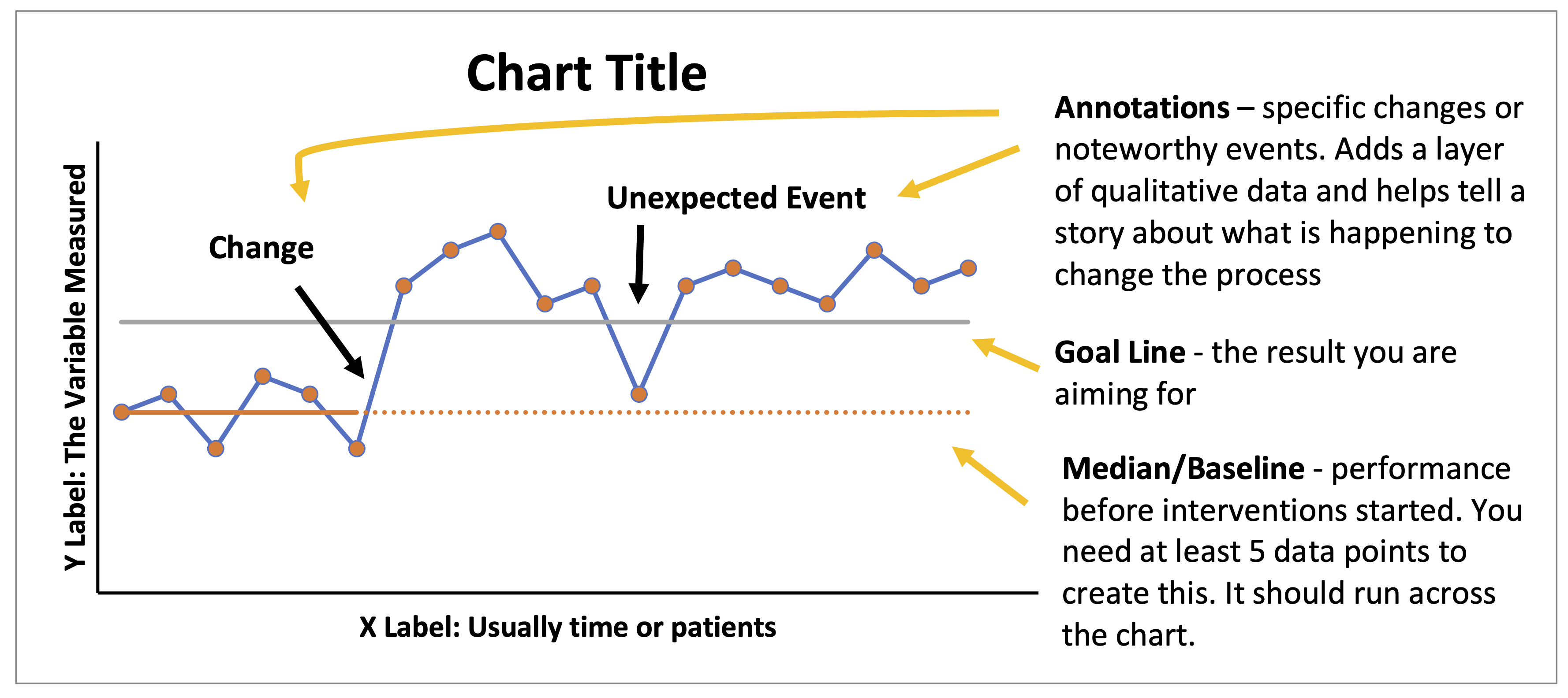
Elements of a Run Chart
Creating a Run Chart
The data you have collected should be entered into a spreadsheet. Create three columns: time series, data and median. The median can be created once you have 12 data points. Once you have 12 data points, use the graph function to plot your run chart with time series on the x-axis and your data on the y-axis. The median should appear as a straight line across the chart. Make sure you annotate the chart and provide qualitative information to reflect when changes were introduced.
Interpretation
You’ve collected your data and plotted it into a run chart. Now you must interpret your results! Before doing this, it is important to take a step back to understand what the chart represents.
Every process has inherent random (common cause) variation. Using run charts, we are able to look for non-random (special cause) variation within the data. Non-random variations provide evidence that the performance has actually changed and is not the result of random variation within the process. We are able to do this by counting runs and applying the four rules of run charts.
Counting Runs
A run consists of one or more consecutive data points on the same side of the median (ignore points that fall on the median). To count runs, either:
- Circle each run and count.
- Count the number of times the line crosses the median and add 1.
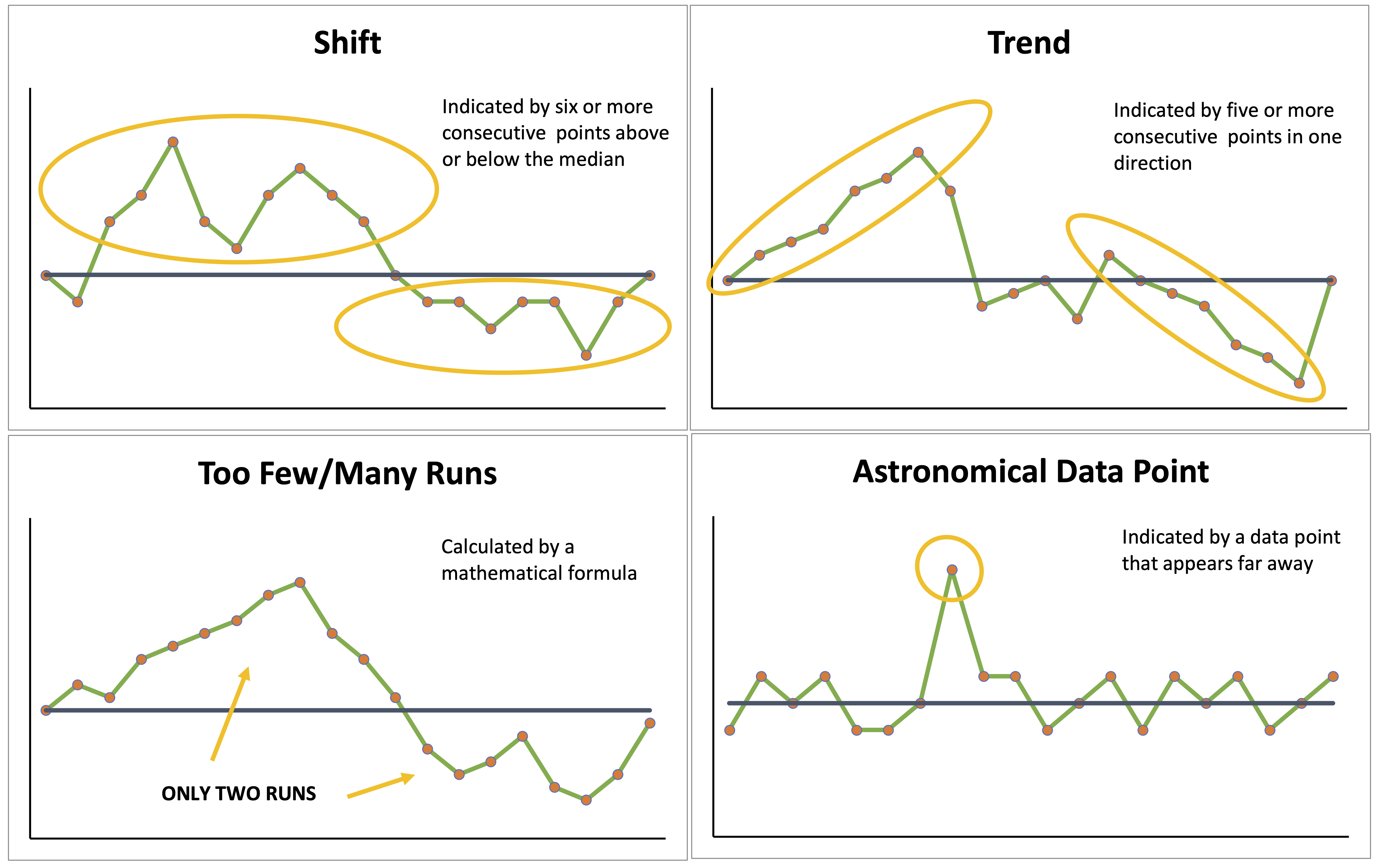
Four Rules of Run Charts
There are four rules that help tell if observed patterns are random (common cause variation) or non-random (special cause variation). If any one rule occurs, you can say there is evidence of non-random patterns (i.e. change has occurred). These rules can only be applied once you have 12 data points (and thus a median) within your run chart. The rules are as follows:
- 1. Shift
- When there are six or more consecutive points above or below the median. If a count falls on the median, it should be ignored and not counted. A shift suggests that values are varying around a new median.
- 2. Trend
- When five or more consecutive points are all increasing or decreasing. If two points are the same, they should only be counted as one and the trend should not be interrupted. A trend suggests the change is having an effect, but you don’t know where performance will settle.
- 3. Too Many or Too Few Runs
- There is an upper and lower limit of runs expected with any given number of data points. These limits are determined by the formula outlined below. If the number of runs falls outside of this range, then there is indication that a non-random pattern has occurred. This suggests that a process has become less/more consistent.
- 4. Astronomical Data Point
- This is a data point that is far away from those around it and signifies there is an attributable cause. If this wasn’t caused by your change, you will want to investigate what caused it.
Read more from NHS Improvement on run charts.
Maximising Use of the Four Rules
If the Shift or Trend rules apply, look into whether the change is associated with your intervention or whether there is another change that is driving it.
When the Too Many/Too Few Runs or Astronomical Data rules apply, this presents an opportunity to look for new ideas for tests of change. Try to understand what has been happening within your test cycle and look for the cause of these changes. For example, you could replicate the cause of an astronomical data point if it produced a beneficial change.
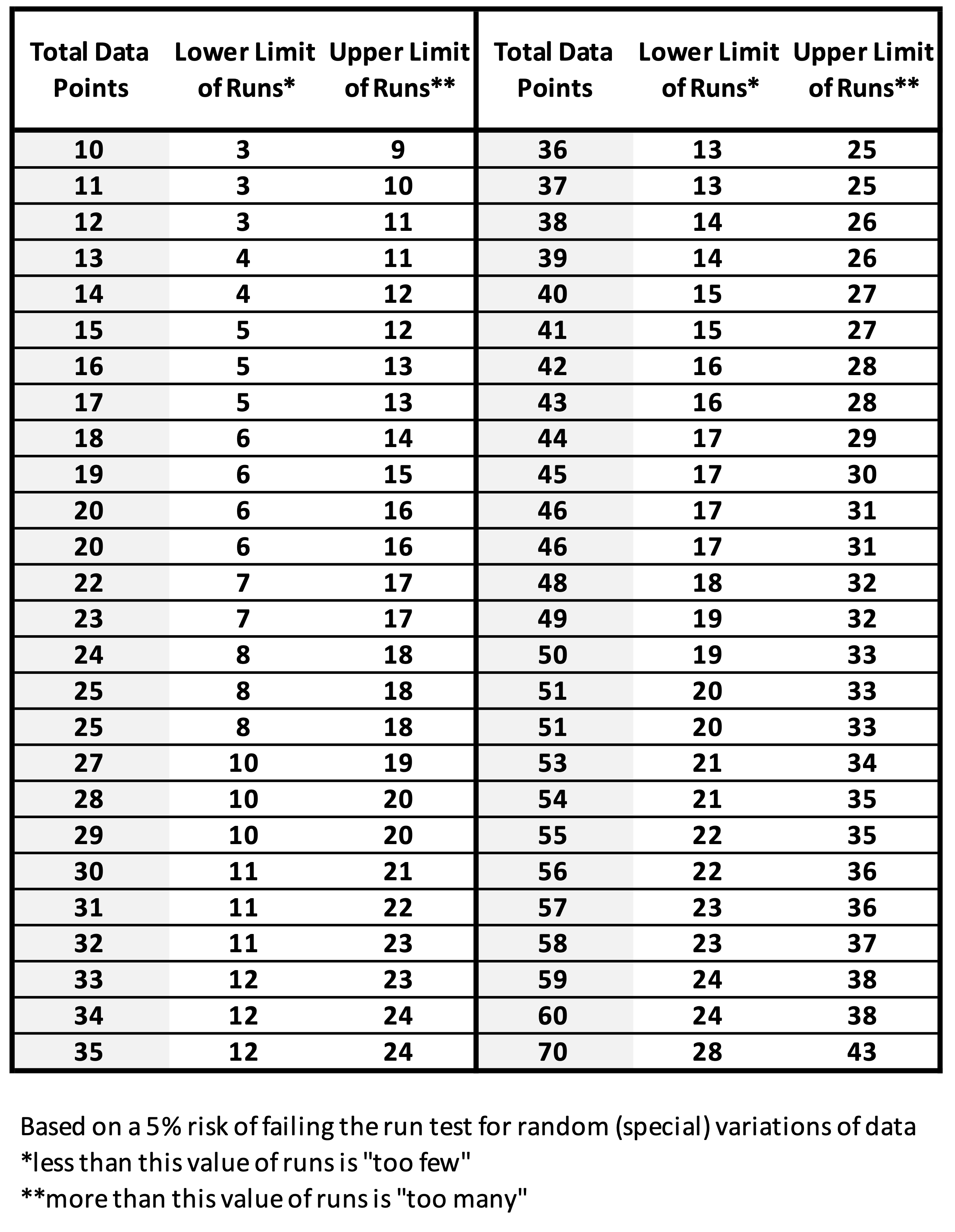
Calculating the Number of Runs
If your number of runs falls outside the upper and lower limit of expected runs, it is likely you are looking at a non-random (special cause) variation. You can approximate the limits using the following formulas:
- Lower Limit: Fewer than n/3 (rounded down)
- Upper Limit: More than 2n/3 (rounded up)
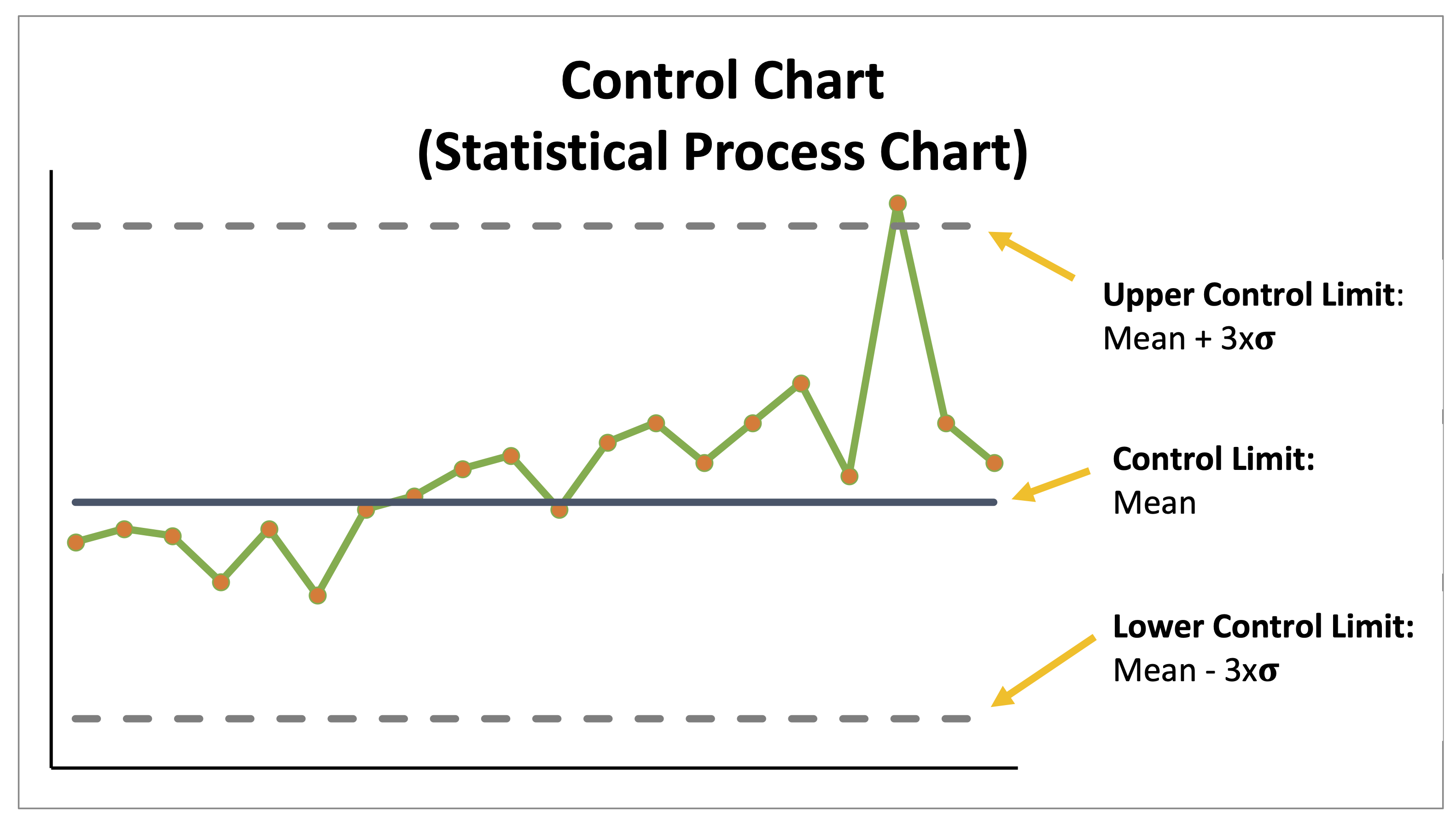
Shewhart Chart (Statistical Process Control Chart)
Once 20 data points have been collected, the median can be transformed into a mean. This allows the addition of upper and lower control limits provided your data has a normal distribution. They are calculated as 3x the standard deviation from the mean. An additional rule can be applied using the control limits to help further identify whether changes are the result of random (common cause) variation or non-random (special cause) variation.
Additional Rule
Control limits help determine if the process is stable (only random variation) or not stable (contain non-random variation). This rule should be applied provided none of the four rules of run charts (explained above) are met.
- 5. Control Chart Additional Rule
- Any data point that falls within the UCL and LCL is part of the random variation in that process (common cause variation). Thus, any data point that falls outside the UCL and LCL or displays non-random variation between the UCL and LCL (see rules 1 – 4) is a non-random cause of variation and indicates a change (or error) has occurred.
If you have no evidence of non-random (special cause) variation, this suggests your process is stable and predictable. Therefore, your Control Chart will only display random (common cause) variation. You should try to reduce the variability of your process in order to standardise outcomes and ensure patient care is consistent. Changing random variation will often require changes to the whole system and potentially to contributing factors outside of the system. You can further assess and quantify random (common cause) variation by examining the number of points that fall between both the control limits and within the middle third region of your chart. You should find this number approximates two-thirds the total number of points on your chart.
One final word on control charts. If your target falls outside of the control limits, it is unlikely that your system is set up to allow you to meet that target. If it is met, this would be an unusual occurrence and unlikely to be sustained.
Read more from NHS Improvement on control charts.
References
- Institute for Healthcare Improvement: Run charts 1
- Institute for Healthcare Improvement: Run charts 2
- Institute for Healthcare Improvement: Control charts 1
- Institute for Healthcare Improvement: Control charts 2
- Institute for Healthcare Improvement: QI essential toolkit
- NHS England: The how to guide for measurement for improvement
- NHS Improvement: Run charts
- NHS Improvement: Statistical process charts