Other Charts
You should have plotted your run charts by this point and used them to identify any non-random (special cause) variation. This is a fantastic way of identifying which changes have had a beneficial effect and which changes have not. This section explores other charts you could use within your quality improvement project to gain further insights into the data you have gathered.
Why do we Need Other Charts?
Run charts are fantastic for seeing if you have encountered a random (common cause) or non-random (special cause) change in your outcome measure. However, if you only view your data by focusing on the low and high points to identify patters or draw conclusions, you will soon run into difficulties. This is because your analysis would be based upon an incomplete understanding of the data and could therefore lead to false assumptions. More specifically, you may see trends where there are none, you may try to explain natural variation as something unusual, you may blame or credit people over things they could not control, and you may deny data that doesn’t fit into the picture you wanted.
Fully exploring the data within your run chart is the first step to understanding variation. This process is enhanced by using other charts which offer new insights and provide another avenue for understanding variation within your data. The other charts don’t need to be used for every project, but should be strongly considered since the ability to spot patterns within your data is important for continuous improvement. The three charts are described below.
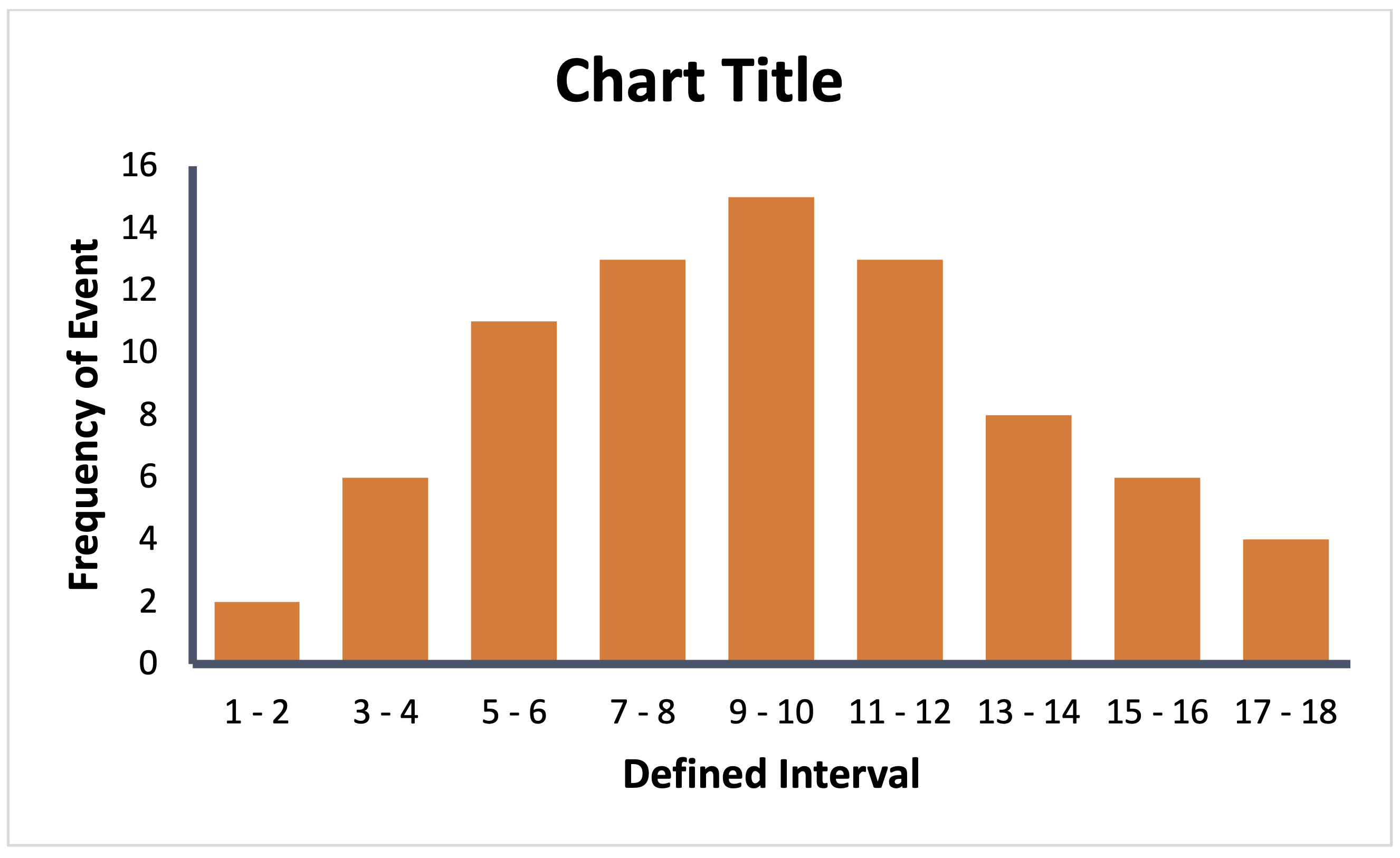
Histograms
Histograms allow you to understand the distribution of continuous data. They do not show how things change over time but can be used early on in your analysis to understand where best to focus your improvement efforts. They can be used to recognise and analyse patterns not apparent from looking at a table or data.
Consider whether or not the distribution is symmetrical (process without outliers) or asymmetrical (process where one interval or side of the chart is favoured over another). A positive skew occurs where the tail appears on the right-hand side. A negative skew occurs when the tail appears on the left-hand side. If your chart has twin or multiple peaks, it could indicate the data is coming from two or more sources. Once a peculiarity is identified, you should investigate the cause for this variation.
To draw, separate your continuous data into equal non-overlapping intervals of defined size and plot the frequency of data points (Y) within each interval (X).
Read more from NHS Improvement on histograms.
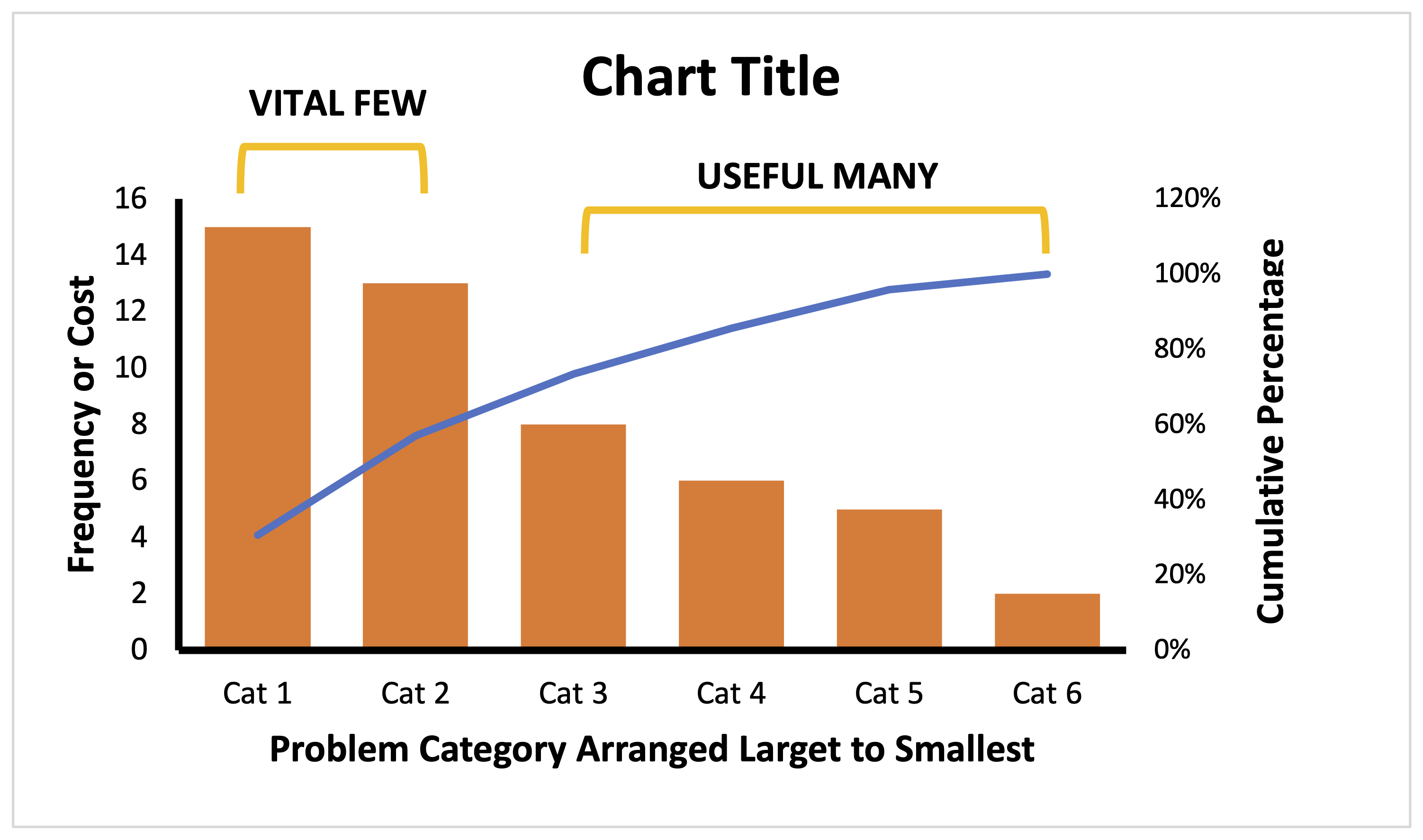
Pareto Charts
Pareto charts refers to the principle that 20% of contributing factors account for 80% of the results. The pareto chart helps you apply this theory to understand and improve your system. It will help identify the vital few factors which have had the greatest effect and thus warrant the most attention. It also provides justification to focus on one area over another.
To draw, you must first collect data about the contributing factors of a problem and their relative impact on the outcome. This is usually the frequency a problem occurs or the cost that is incurred. You then construct a bar chart where the factors are arranged in order of increasing magnitude of their effect. Overlay a line representing the cumulative total percentage contribution.
Read more from NHS Improvement on pareto charts.
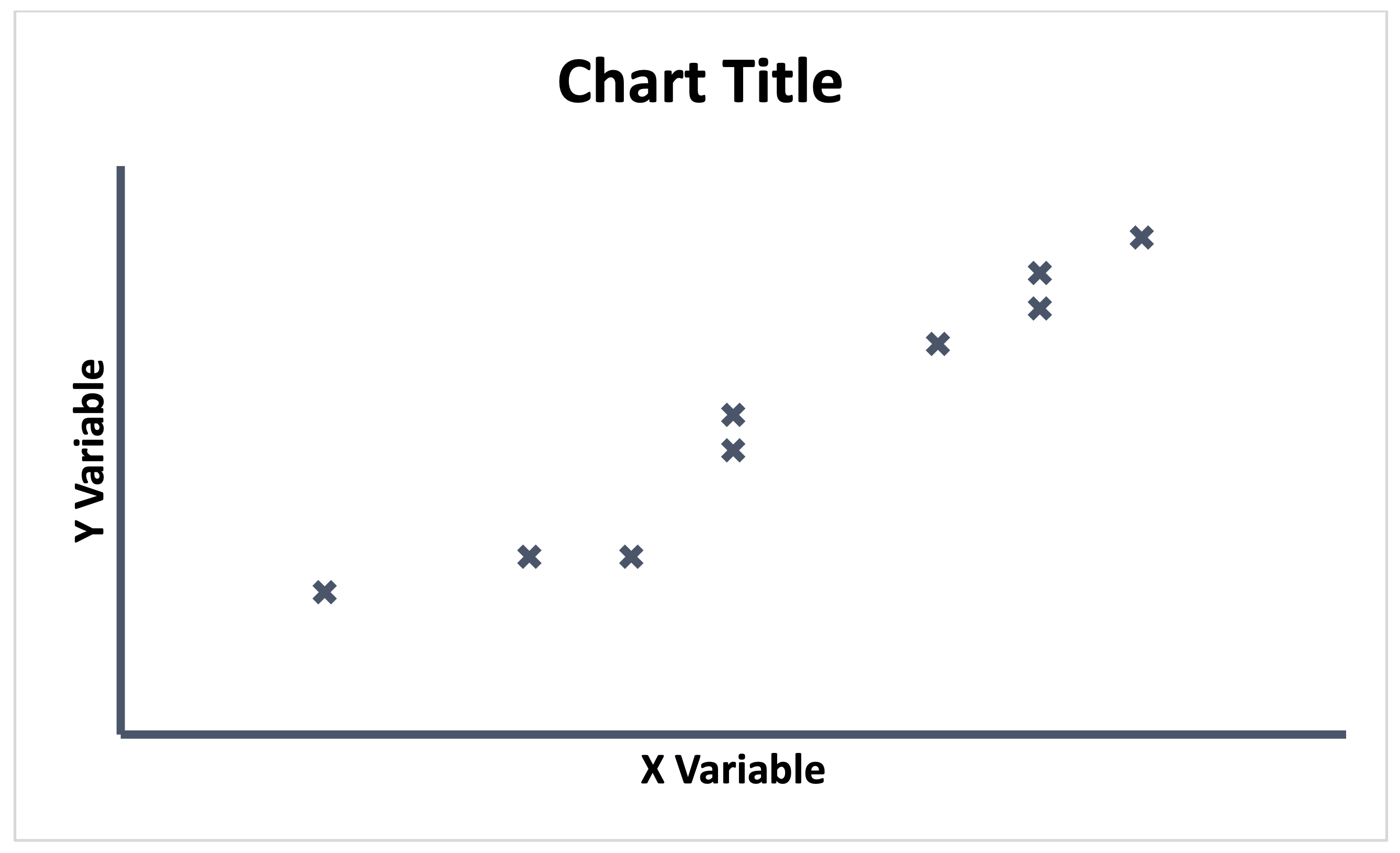
Scatter Plots
A scatter plot is a graphical representation between two variables. They can be used to help identify and understand cause-effect relationships between two variables and therefore understand which ones might affect the project measures. This ensures you are focusing improvement efforts on the true cause of a problem. If used well, you will see unusual patterns, data that is affected by special cause variation and interesting clusters of data points. It can also show how changes in process measures affect your outcome. Remember, a relationship or correlation is not the same as causation. They may be influenced by a third variable!
To draw, simply plot your X values against your Y values.
Read more from NHS Improvement on scatter charts.